San Francisco’s flag design leaves room for improvement. Wikimedia Commons
California’s cringeworthy city flags
Many Californians are unaware that at least 160 cities across the state have official flags. That could be because most appear to have been the product of bureaucratic afterthought — epitomized by a style known derisively as a “seal on a bedsheet.”
The scourge of ugly municipal flags drew wide attention a few years ago when Roman Mars, the host of the 99% Invisible podcast, delivered a TED talk that made a powerful call to do something about it.
When he showed the audience San Francisco’s flag, laughter erupted. “I know,” he said. “It hurts me, too.”

Adopted in 1940, San Francisco’s flag shows a rising Phoenix and the motto “Oro en paz y fierro en guerra,” meaning “Gold in peace and iron in war.”
According to the North American Vexillological Association, there are five rules to good flag design: Keep it simple, use meaningful symbolism, use two or three basic colors, no lettering or seals, and be distinctive.
San Francisco, like many California cities, manages to break almost all of them. After his TED talk, Mars teamed up with the software maker Autodesk, based in San Rafael, on a campaign to shame the city into action. Signatures were gathered, redesigns were floated, and city leaders were implored.
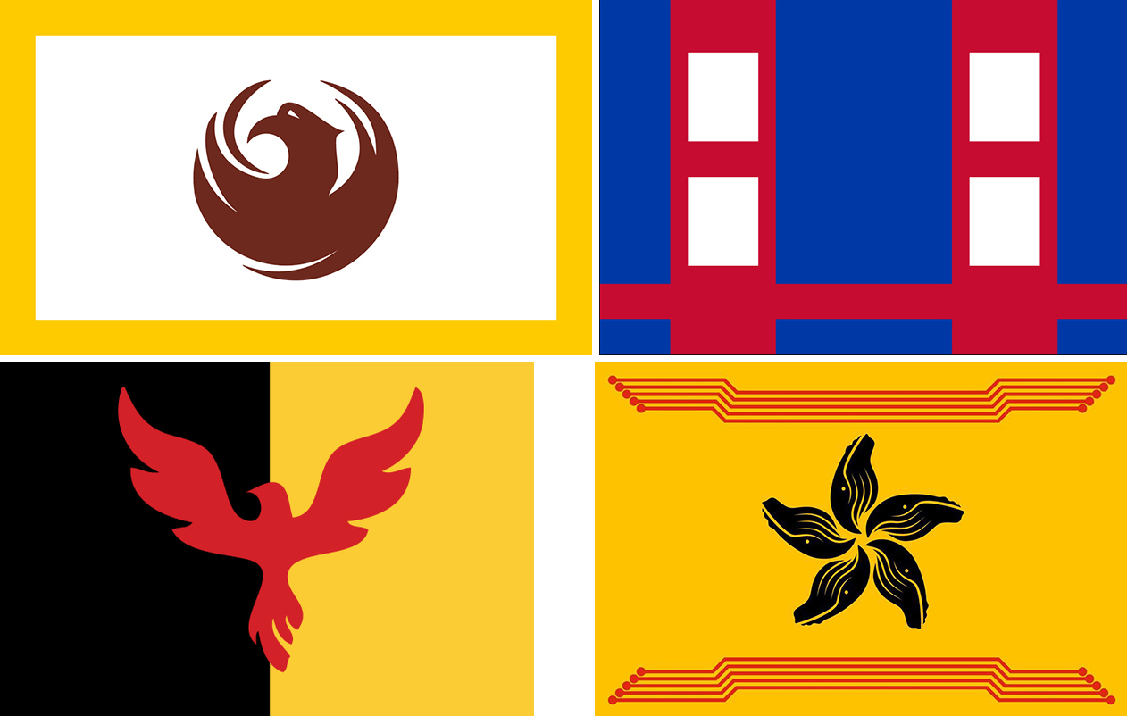
Some of the proposed redesigns of the San Francisco flag. These drop the lettering and use imagery evoking a phoenix, the Golden Gate Bridge, and Humpback Whales.
Clockwise from top left: Reddit user BoogsterSU2, Reddit user masongb, Reddit user 1clkgtramg, and Neil Mussett.
Speaking by phone, Mars said the effort ultimately died after facing pushback from officials in the form of a depressingly common refrain: “We have bigger priorities to tackle.”
“It’s really hard,” Mars said. “It’s hard to have a thing that generally nobody cares about and then say, ‘Well, I’m going to start a big fight about a thing and then all of a sudden they’ll start caring about it.'”
But flags are much more than cloth and ink. The pro-redesign forces point to places like Chicago, an exemplar of good flag design, where the city banner flies all over town. Tattoos that incorporate the design are not uncommon.
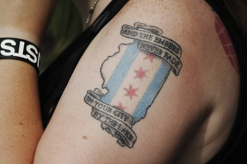
Chicagoans love their city flag so much they use it in tattoos.
francesco villa/CC BY-NC-ND 2.0
Ted Kaye, the author of “Good Flag, Bad Flag,” said Mars was correct when he argued that people who love their flag actually love their city more. “‘This is who we are. I’m a part of this team. This is my tribe,'” Kaye said. “That’s what flags are about. And that’s what flags can do for the people of a city.”
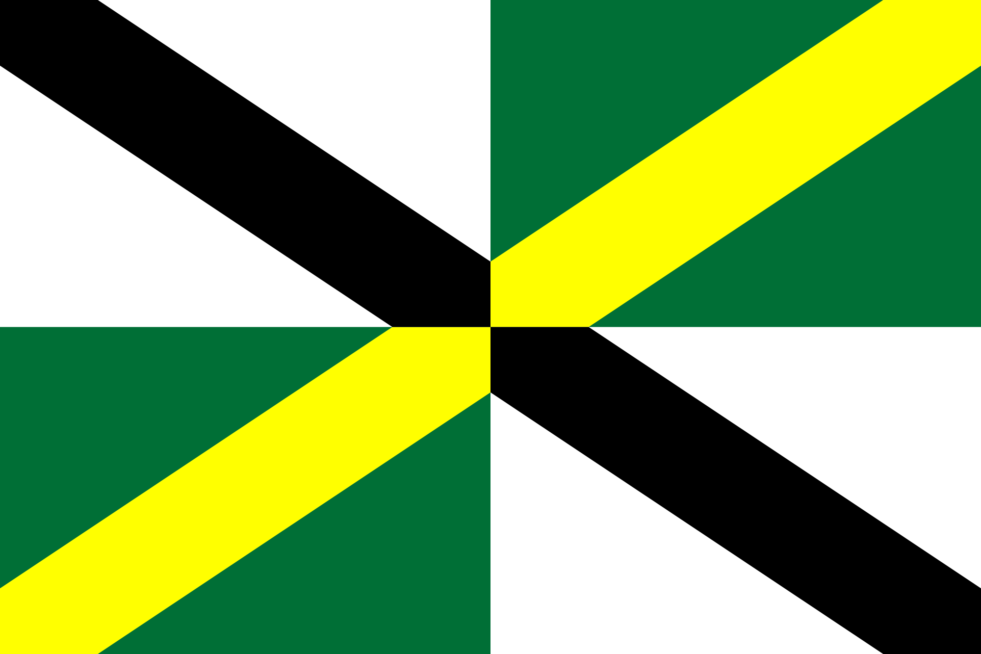
Other California cities have gotten the message. In the last year, both Anaheim and Redding adopted vastly improved flag designs.
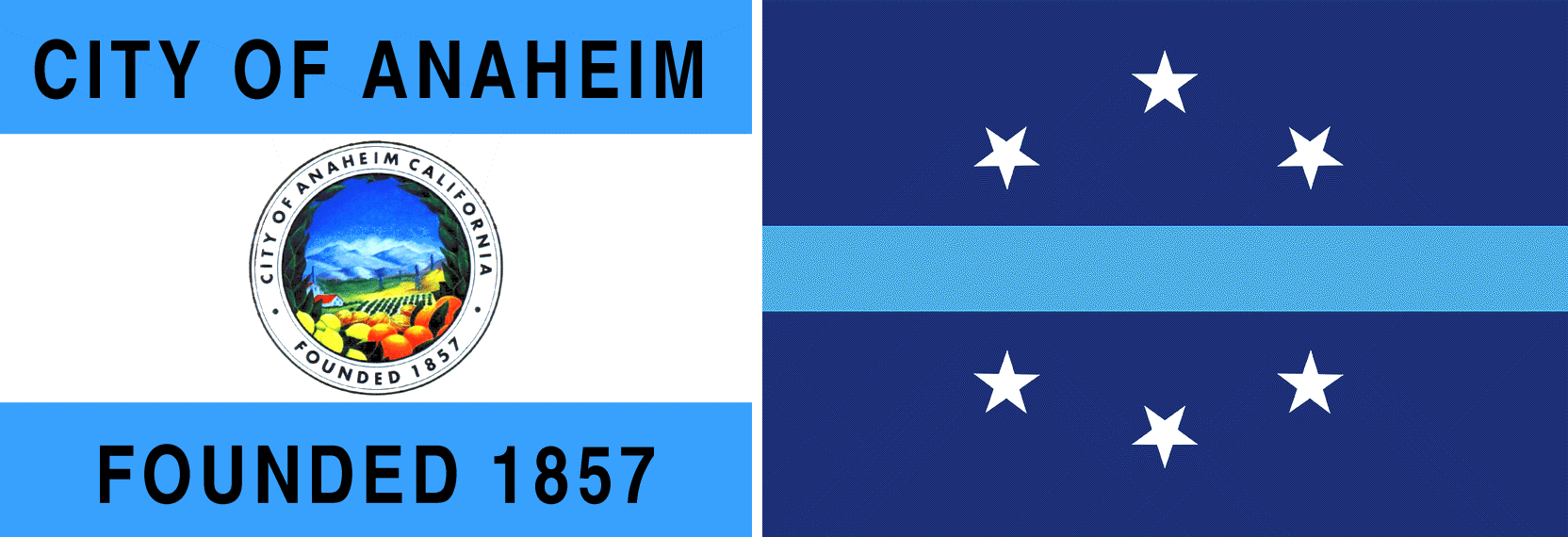
The old Anaheim flag, left, and the redesigned banner, which includes light blue for the Santa Ana River and six stars for six council districts.
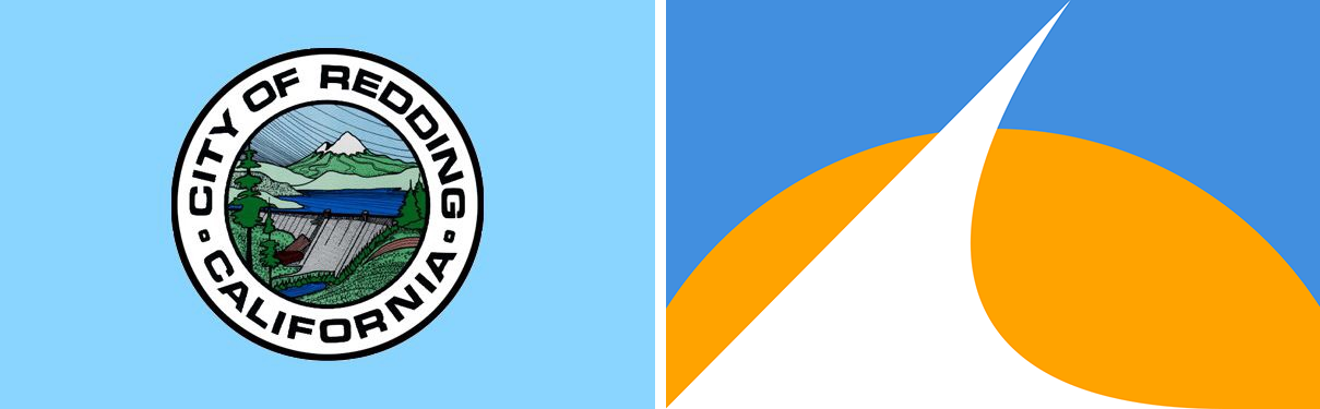
The old Redding flag, left, and the redesigned version, which represents sky, water, sun, and the city’s Sundial Bridge.
The Redding campaign faced the usual resistance from critics who called it “frivolous,” said Kallie Markle, who helped spearhead the effort.
But the Mars talk created buzz. A design contest was held, drawing hundreds of entries, and the city’s seal-on-a-bedsheet flag was replaced last December by a tricolor scheme featuring Redding’s Sundial Bridge. Now, Markle said, “We have flags flying all over the city.”
So what other California cities would be promising candidates to step up next? We asked Kaye for guidance. He identified three city flags in each of three categories: Good, bad, and easily improved. His picks and remarks:
The good
Both Anaheim — “clean, distinctive, meaningful” — and Redding — “iconic bridge design, crisp curves” — made the cut.
So did Monterey, whose flag evokes the city’s Spanish heritage. Kaye called it “heraldically correct and historically relevant.”
The Monterey flag.
The bad
Bakersfield — “Who can recognize this flag from more than a few feet away?”
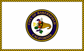
Bakersfield’s flag.
San Jose — “Using the seal reduces the size of the strongest elements — the stripes.”
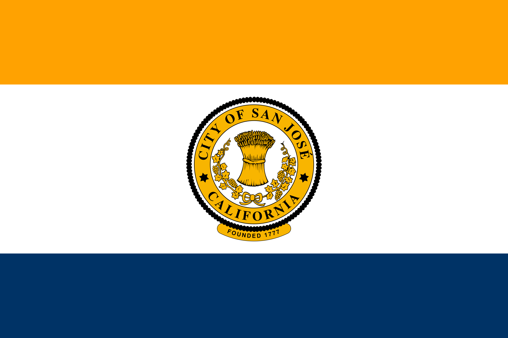
San Jose’s flag.
Glendale — “You can’t make out our seal at any distance, so we’ll write our name for you.”
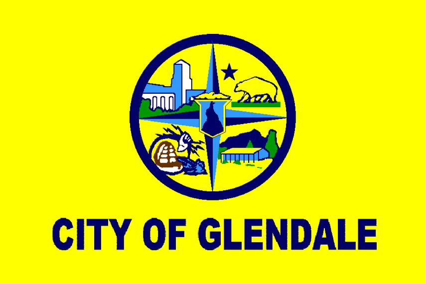
Glendale’s flag.
The easily improved
Los Angeles — “Remove the seal and make the green, yellow, and red sections the same width.”
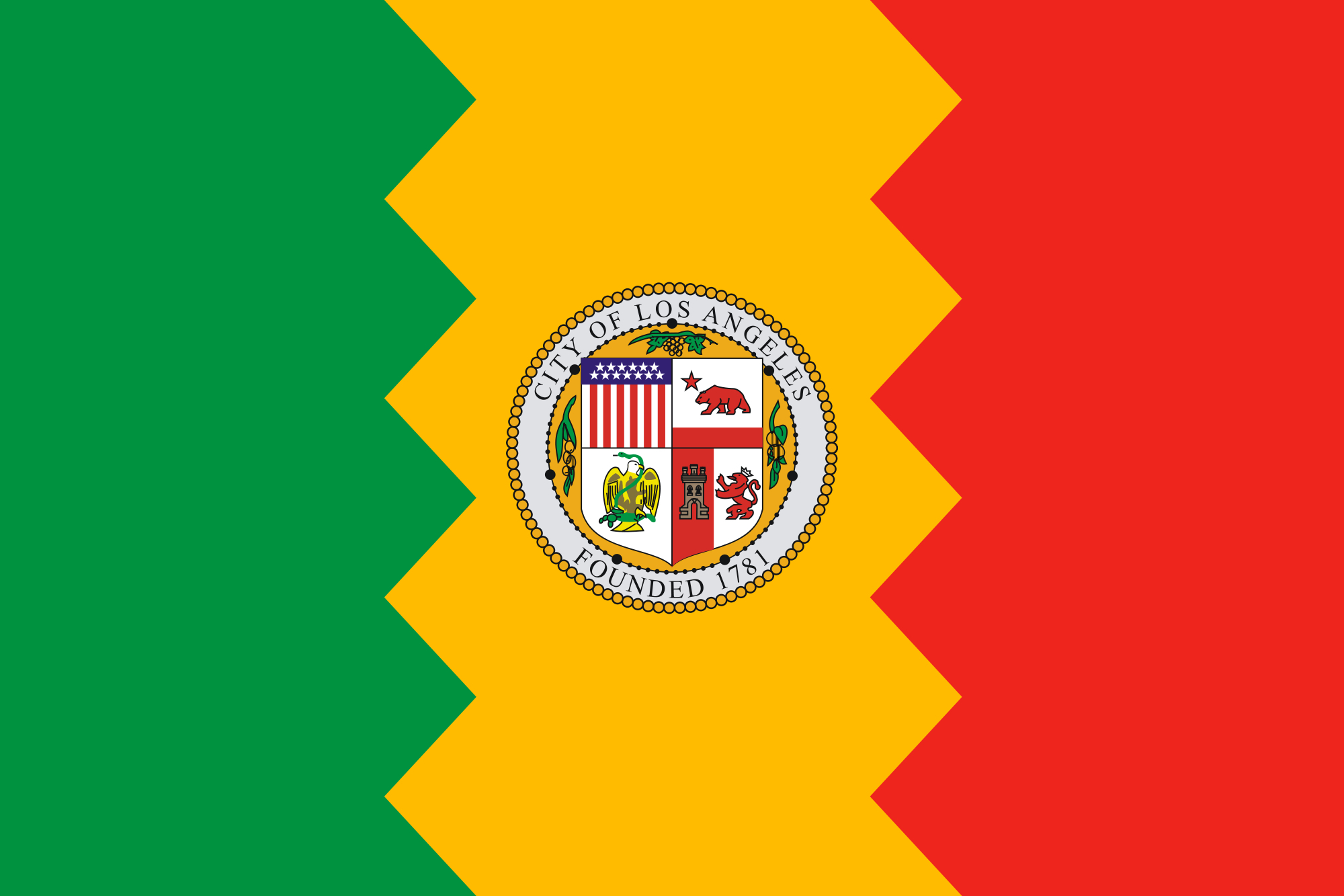
Los Angeles’s flag.
Fresno — “Remove the lettering, simplify the gear (and make it light blue) and remove the white disk around the sun, lighten the blue and darken the green.”
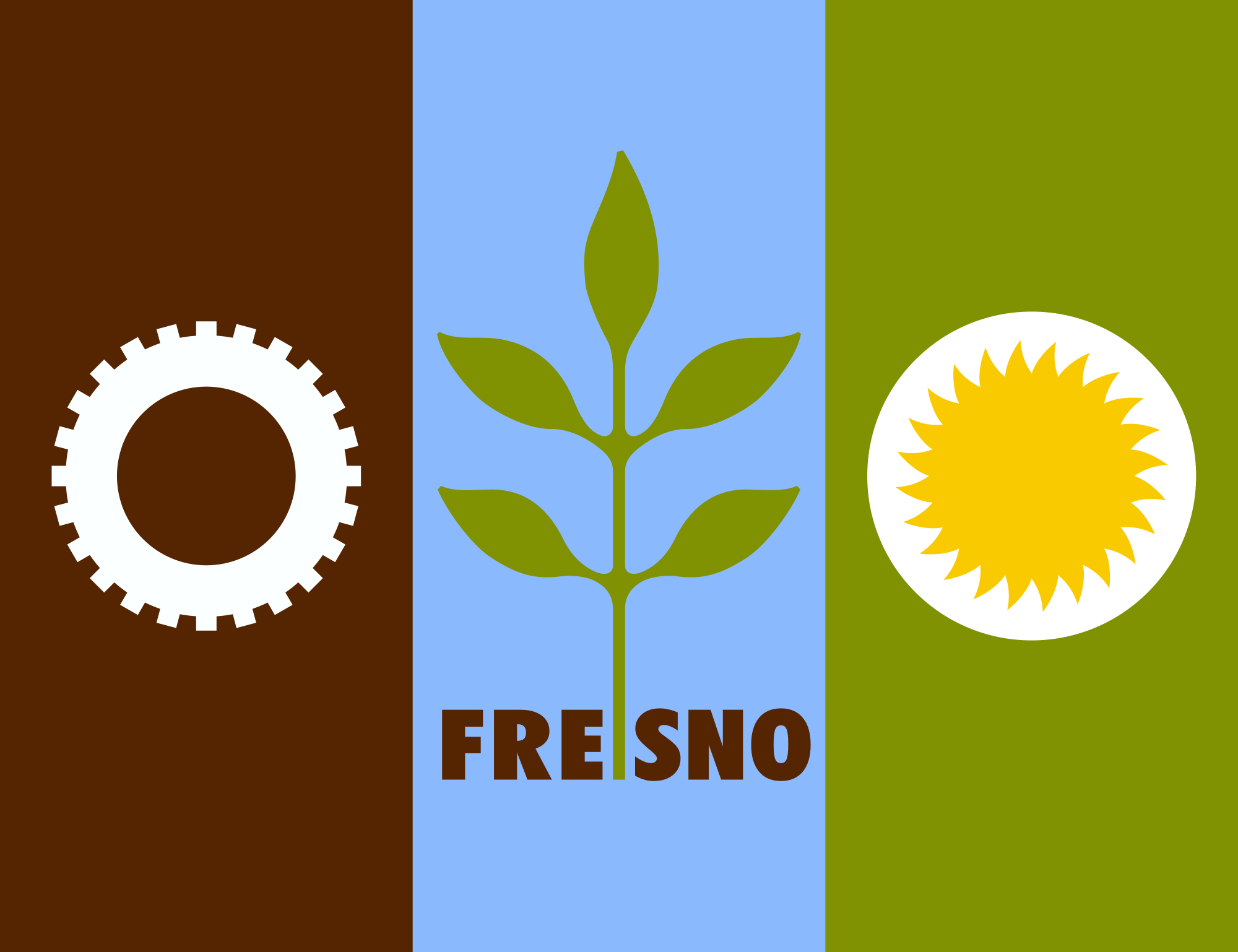
Fresno’s flag.
Oakland — “Remove the lettering and make the tree larger.”
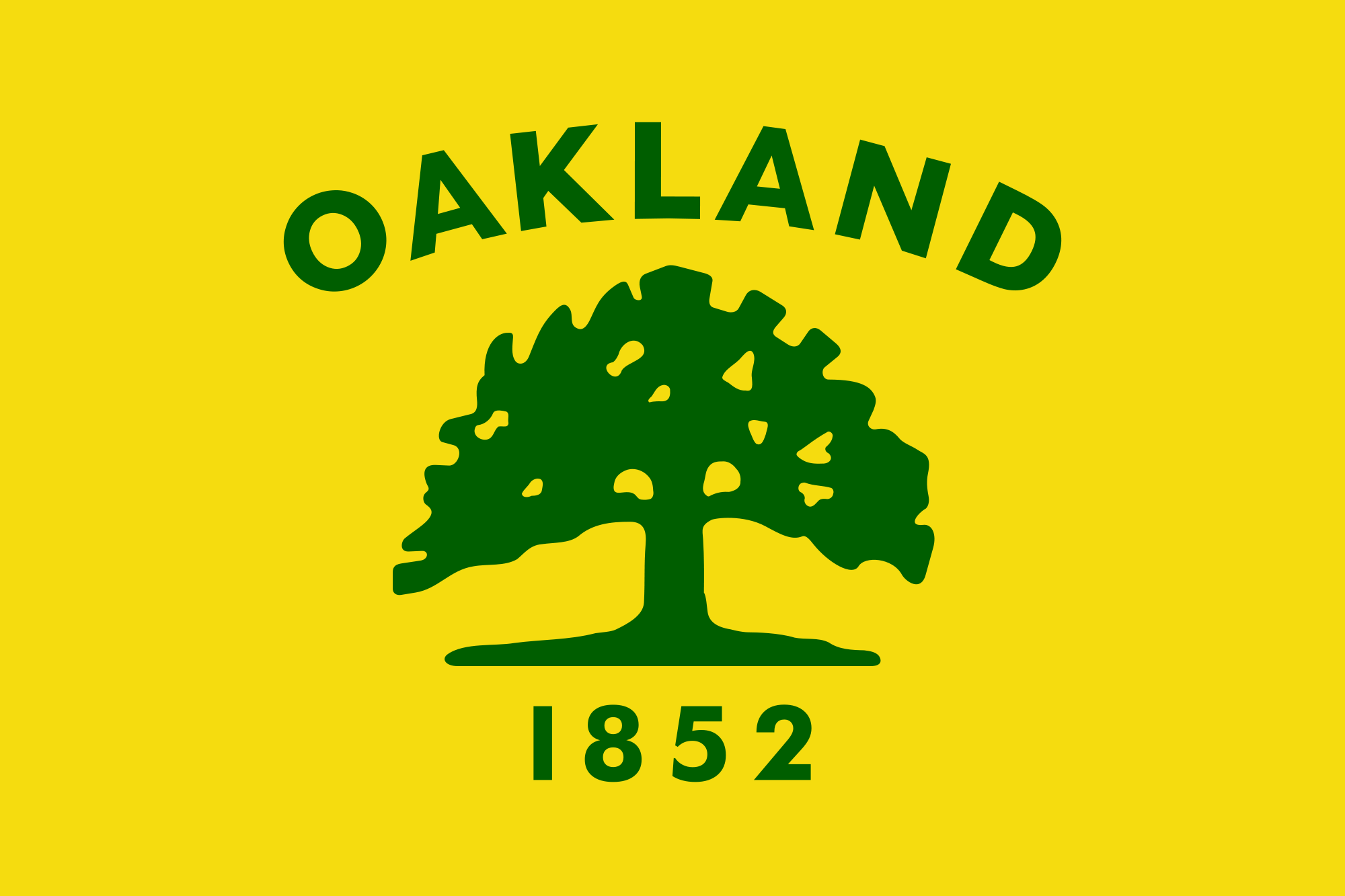
Oakland’s flag.
This article is from the California Sun, a newsletter that delivers California’s most compelling news to your inbox each morning — for free. Sign up here.
Get your daily dose of the Golden State.